library(predtools)
library(magrittr)
library(dplyr)
#>
#> Attaching package: 'dplyr'
#> The following objects are masked from 'package:stats':
#>
#>     filter, lag
#> The following objects are masked from 'package:base':
#>
#>     intersect, setdiff, setequal, union
library(ggplot2)
What is calibration plot?
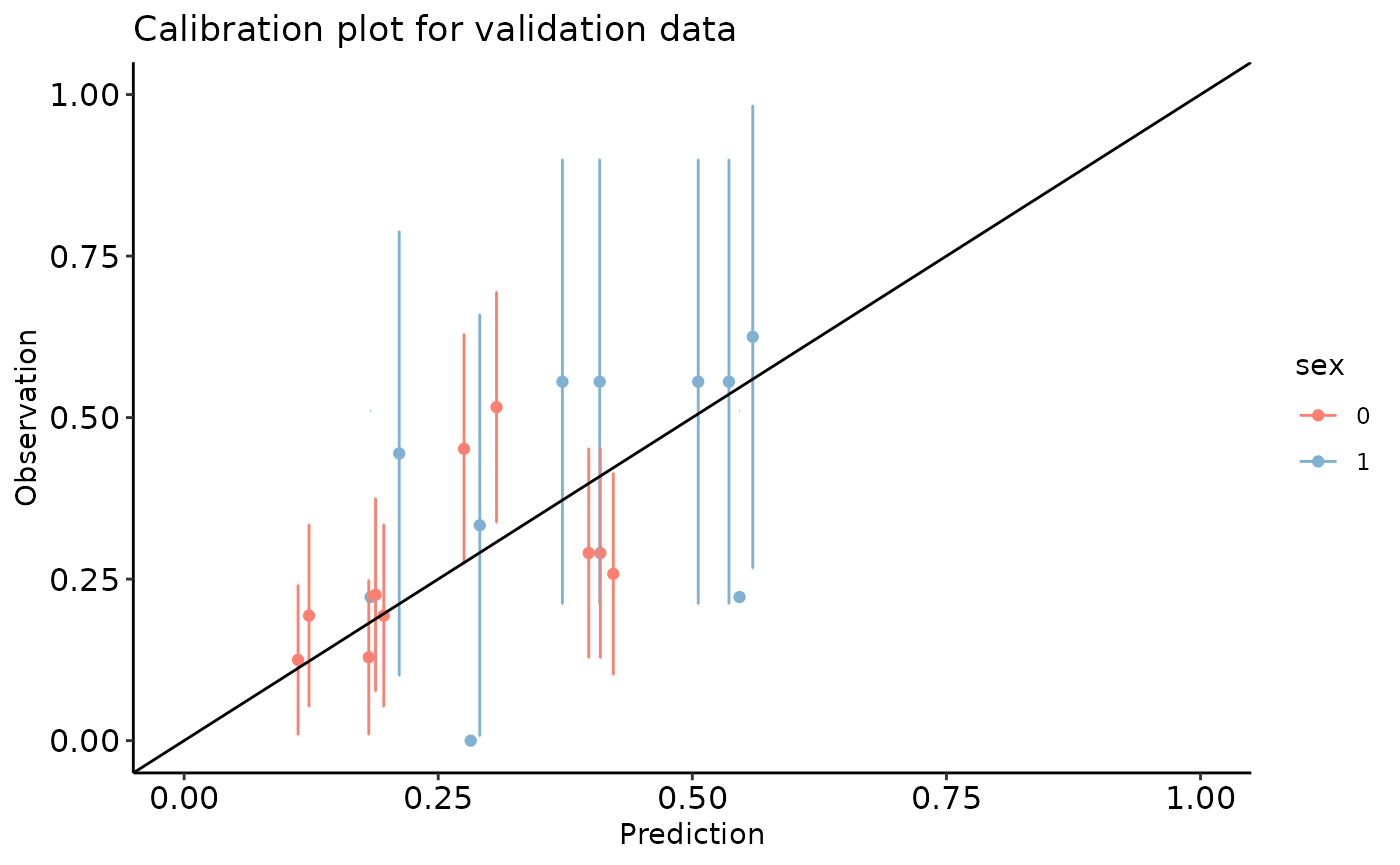
Calibration plot is a visual tool to assess the agreement between predictions and observations in different percentiles (mostly deciles) of the predicted values.
calibration_plot function constructs calibration plots
based on provided predictions and observations columns of a given
dataset. Among other options implemented in the function, one can
evaluate prediction calibration according to a grouping factor (or even
from multiple prediction models) in one calibration plot.
A step-by-step guide.
Imagine the variable y indicates risk of disease recurrence in a unit of time. We have a prediction model that quantifies this risk given a patient’s age, disease severity level, sex, and whether the patient has a comorbidity.
The package comes with two exemplary datasets. dev_data
and val_data. We use the dev_data as the development sample
and the val_data as the external validation sample.
dev_data has 500 rows. val_data has 400
rows.
Here are the first few rows of dev_data:
| age | severity | sex | comorbidity | y |
|---|---|---|---|---|
| 55 | 0 | 0 | 1 | 1 |
| 52 | 1 | 0 | 0 | 0 |
| 63 | 0 | 0 | 1 | 0 |
| 61 | 1 | 1 | 1 | 1 |
| 58 | 0 | 1 | 0 | 0 |
| 54 | 1 | 0 | 0 | 1 |
| 45 | 0 | 0 | 0 | 0 |
We use the development data to fit a logistic regression model as our risk prediction model:
reg <- glm(y~sex+age+severity+comorbidity,data=dev_data,family=binomial(link="logit"))
summary(reg)
#>
#> Call:
#> glm(formula = y ~ sex + age + severity + comorbidity, family = binomial(link = "logit"),
#>     data = dev_data)
#>
#> Coefficients:
#>              Estimate Std. Error z value Pr(>|z|)
#> (Intercept) -1.728929   0.565066  -3.060  0.00222 **
#> sex          0.557178   0.223631   2.492  0.01272 *
#> age          0.005175   0.010654   0.486  0.62717
#> severity    -0.557335   0.227587  -2.449  0.01433 *
#> comorbidity  1.091936   0.209944   5.201 1.98e-07 ***
#> ---
#> Signif. codes:  0 '***' 0.001 '**' 0.01 '*' 0.05 '.' 0.1 ' ' 1
#>
#> (Dispersion parameter for binomial family taken to be 1)
#>
#>     Null deviance: 602.15  on 499  degrees of freedom
#> Residual deviance: 560.41  on 495  degrees of freedom
#> AIC: 570.41
#>
#> Number of Fisher Scoring iterations: 4
Given this, our risk prediction model can be written as:
\(\bf{ logit(p)=-1.7289+0.5572*sex+0.0052*age-0.5573*severity+1.0919*comorbidity}\).
Now, we can create the calibration plot in development and validation
datasets by using calibration_plot function.
dev_data$pred <- predict.glm(reg, type = 'response')
val_data$pred <- predict.glm(reg, newdata = val_data, type = 'response')

calibration_plot(data = dev_data, obs = "y", pred = "pred", title = "Calibration plot for development data", y_lim = c(0, 0.7), x_lim=c(0, 0.7))
#> $calibration_plot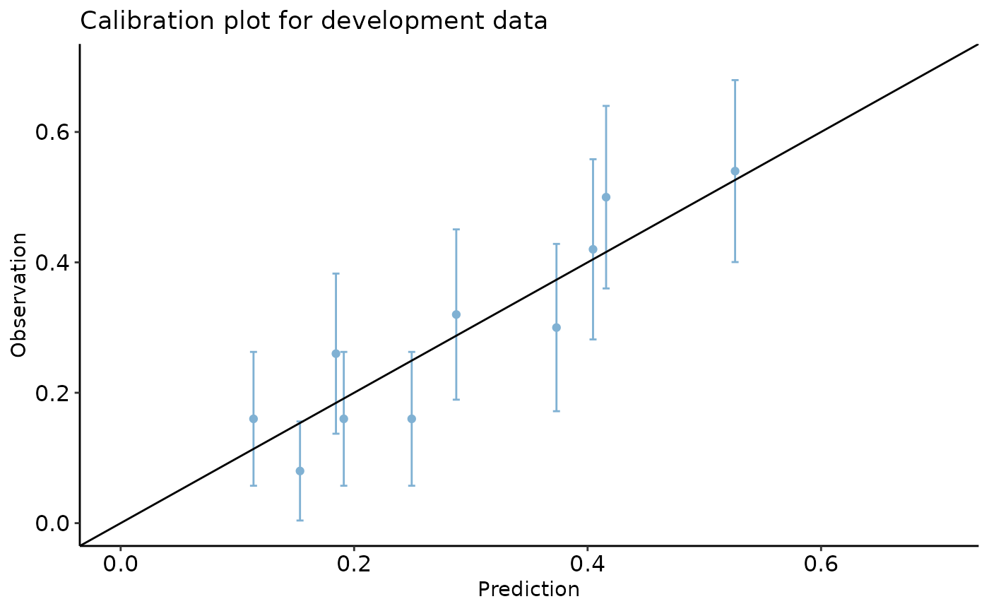
calibration_plot(data = val_data, obs = "y", pred = "pred", y_lim = c(0, 1), x_lim=c(0, 1),
                 title = "Calibration plot for validation data", group = "sex")
#> $calibration_plot